Athletic Resilience was built entirely from scratch — starting with early logo sketches on paper and evolving into a full-scale brand identity. Through structured exploration, refined shapes, and precise composition, we developed a system that captures the essence of movement and focus. The result is a brand that feels strong, modern, and disciplined — reflecting the energy and mindset of those who never stop improving.
Brand Identity
Logo Design
Typography
Art Direction
01 / THE CHALLENGE
Build a brand from the ground up that captures the discipline, energy, and resilience behind an active mindset.
02 / OUR APPROACH
From early sketches to a refined identity: precise shapes, confident typography, and art direction rooted in movement and focus.
01 / ATHLETIC
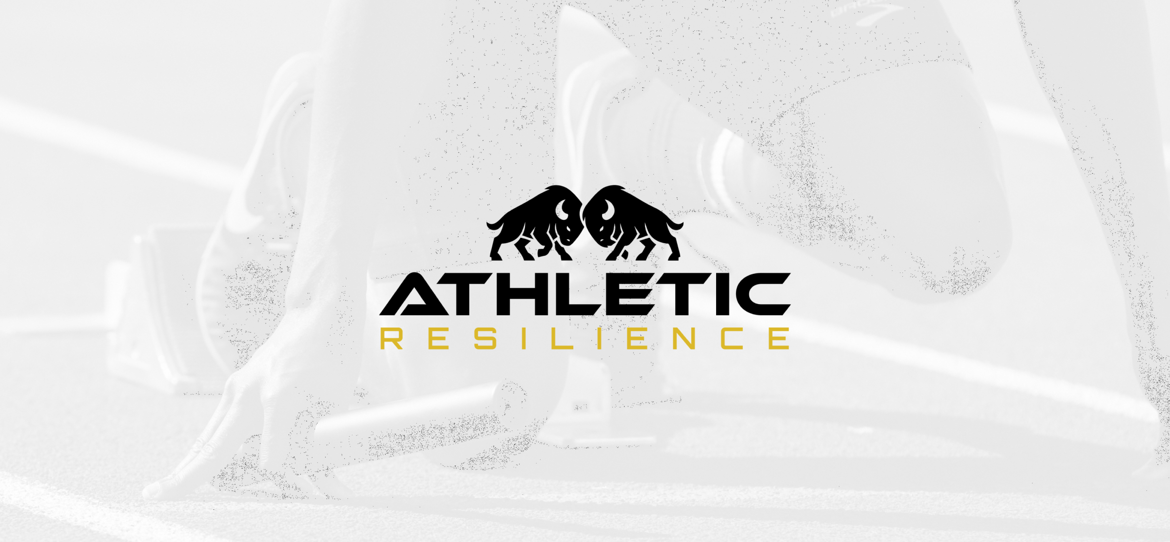
Logo & visual identity
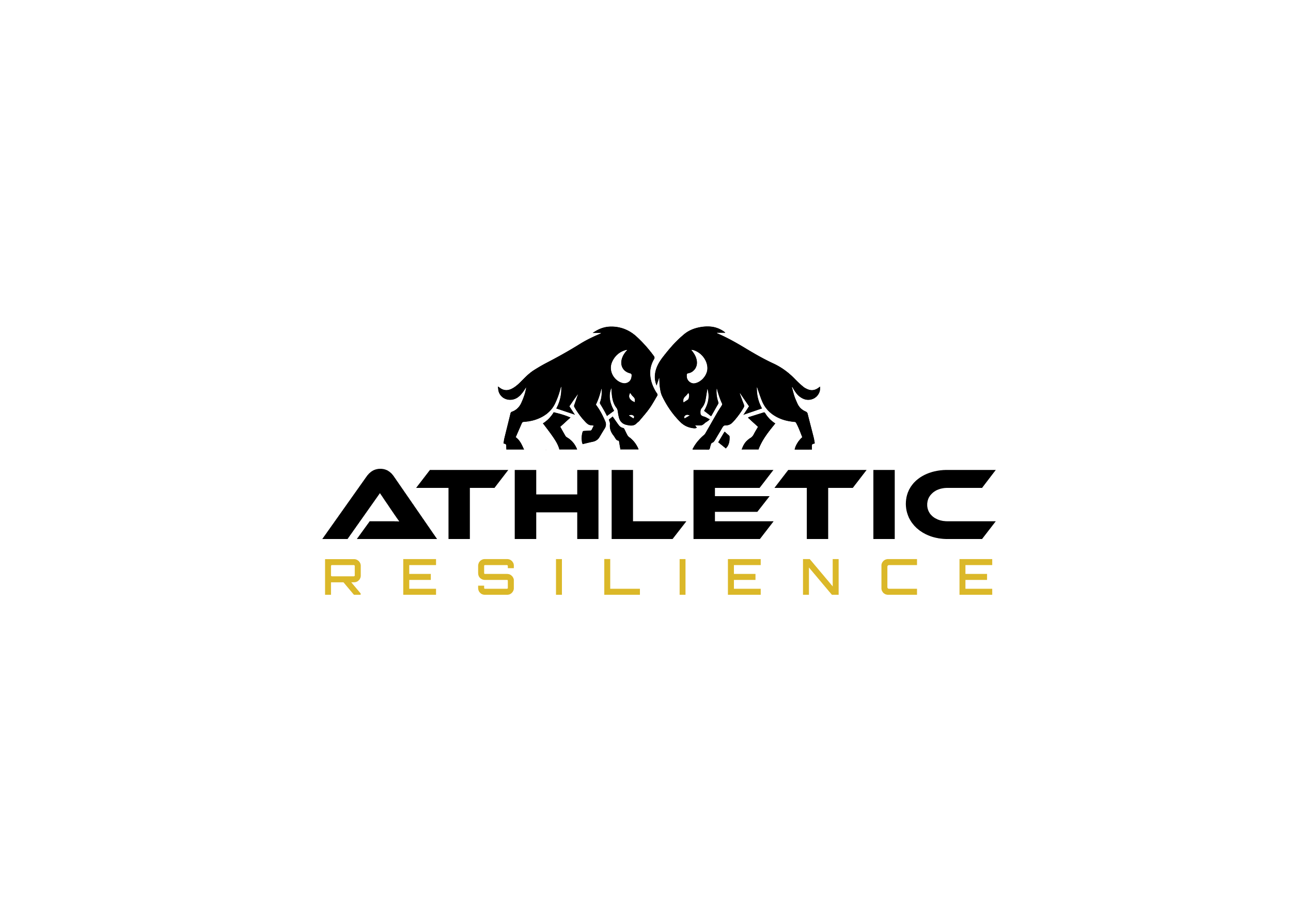
Built from early sketches, the identity balances movement with precision. A confident typographic system and a focused color palette give Athletic Resilience a strong foundation for apparel, campaigns, and everyday applications.

02 / ATHLETIC
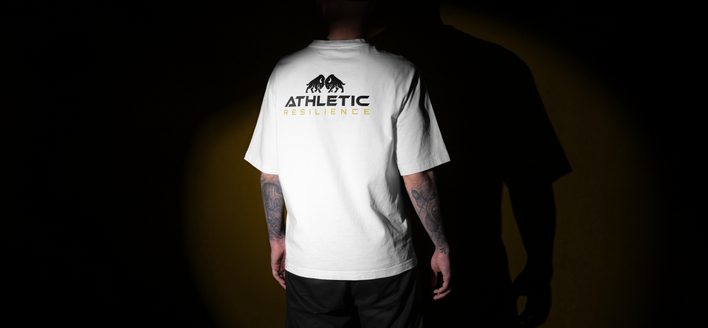
Apparel & brand applications
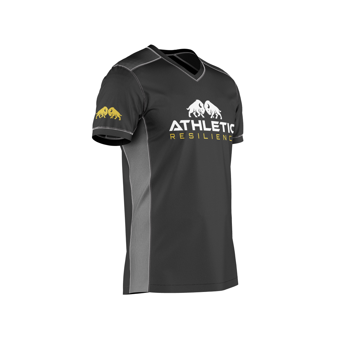
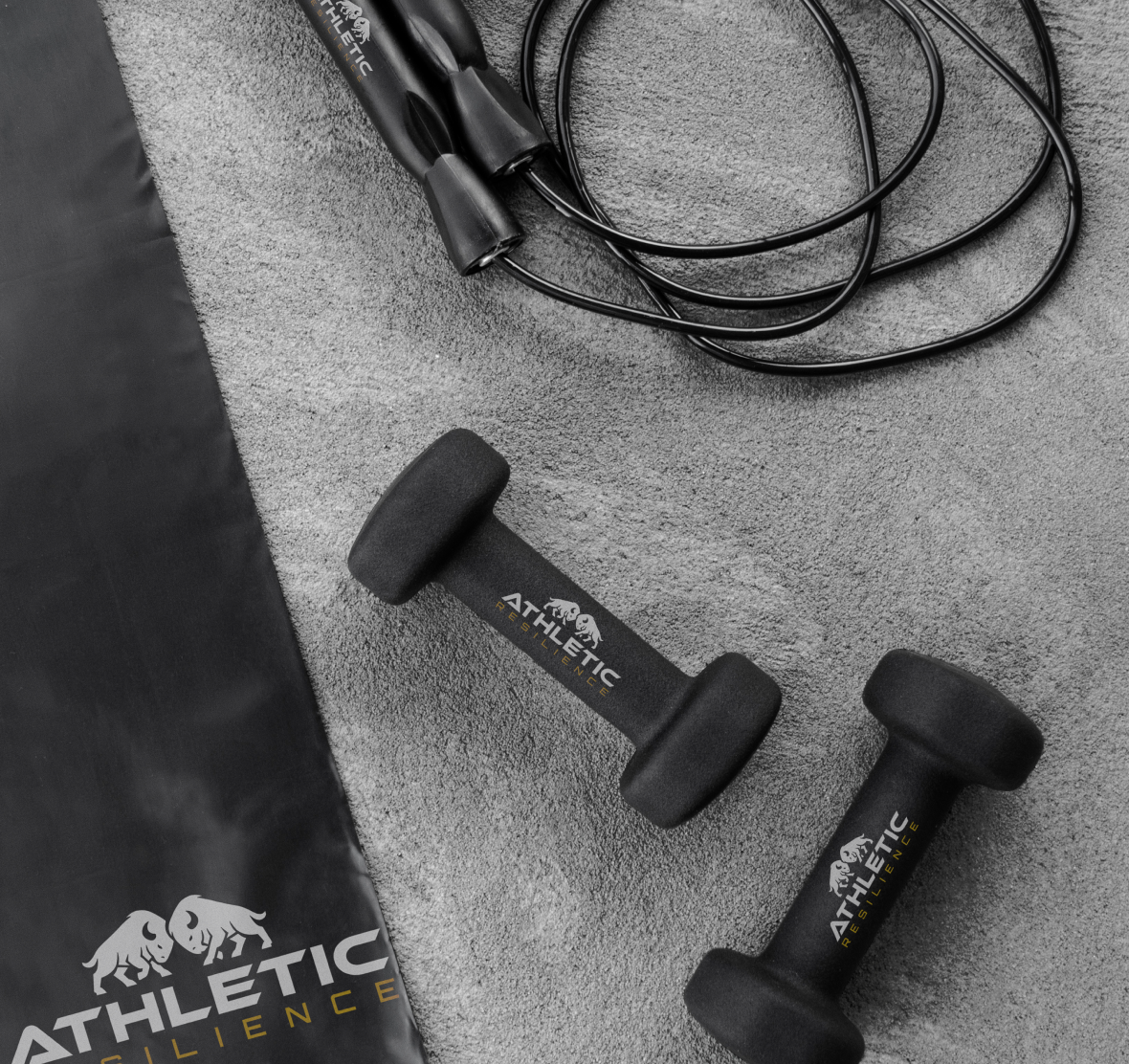
The brand comes to life through apparel and training accessories. Logo placement, scale, and contrast create a cohesive look across different materials while keeping each application clear and purposeful.
03 / ATHLETIC
Art direction & campaign
Campaign imagery brings the identity into an active, human context. The direction connects a disciplined visual system with the energy of training, creating a brand expression that feels focused and dynamic.