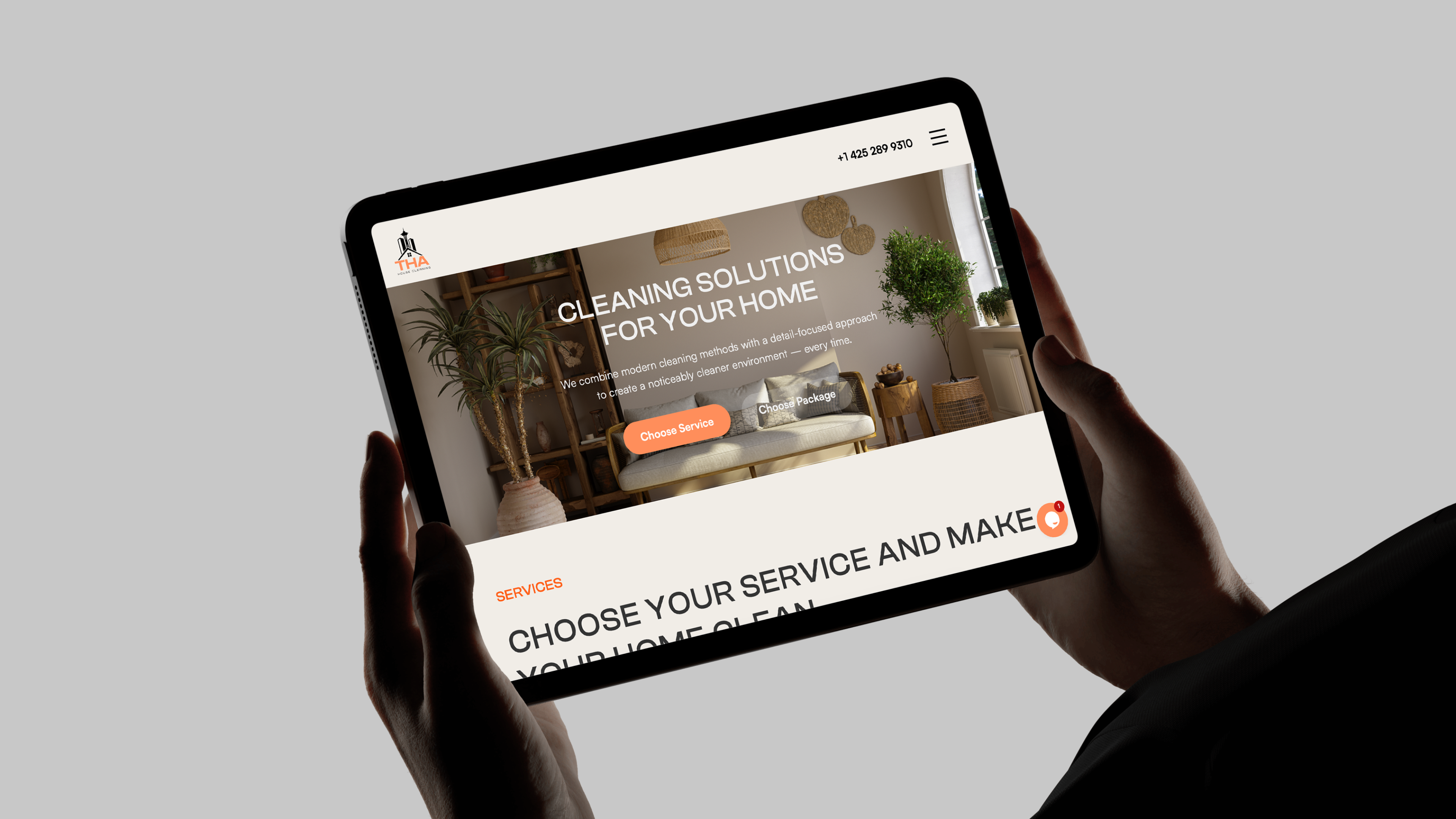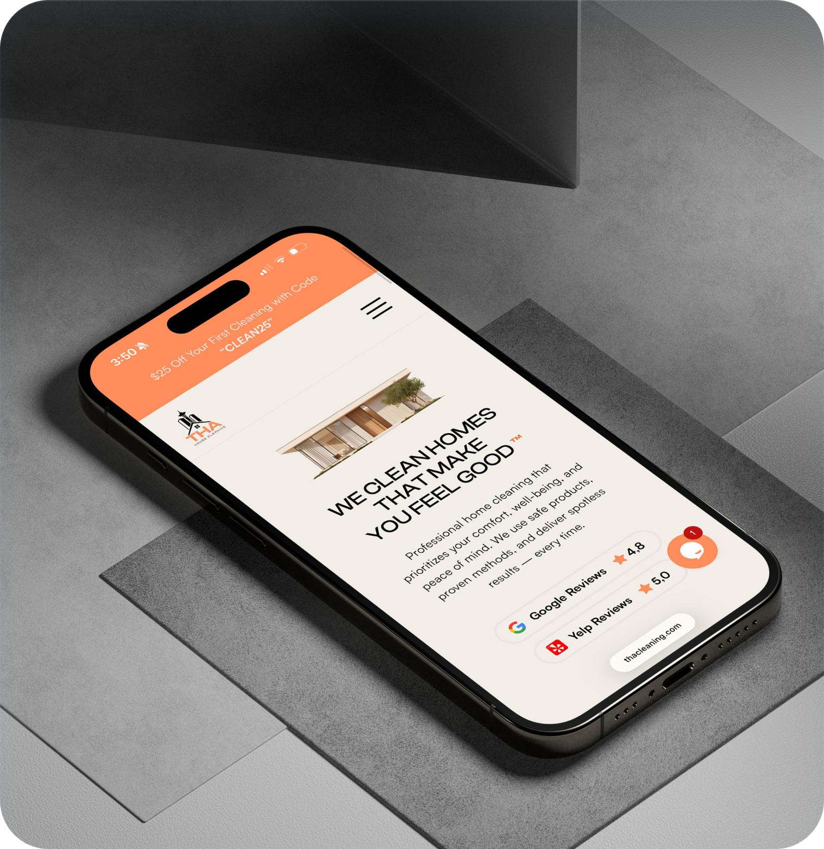
One cohesive experience, from the first impression to the final click. We created THA House Cleaning’s logo, visual identity, printed materials, and responsive website — bringing a warm, professional brand to life across physical and digital touchpoints.
Brand Identity
Logo Design
Print Design
UI/UX Design
Webflow Development
01 / THE CHALLENGE
Give a Seattle cleaning company a clear, welcoming identity that communicates professionalism and care.
02 / OUR APPROACH
Build one connected system — a distinctive logo, a warm visual language, considered print design, and an intuitive website.
01 / THA CLEANING
Logo design
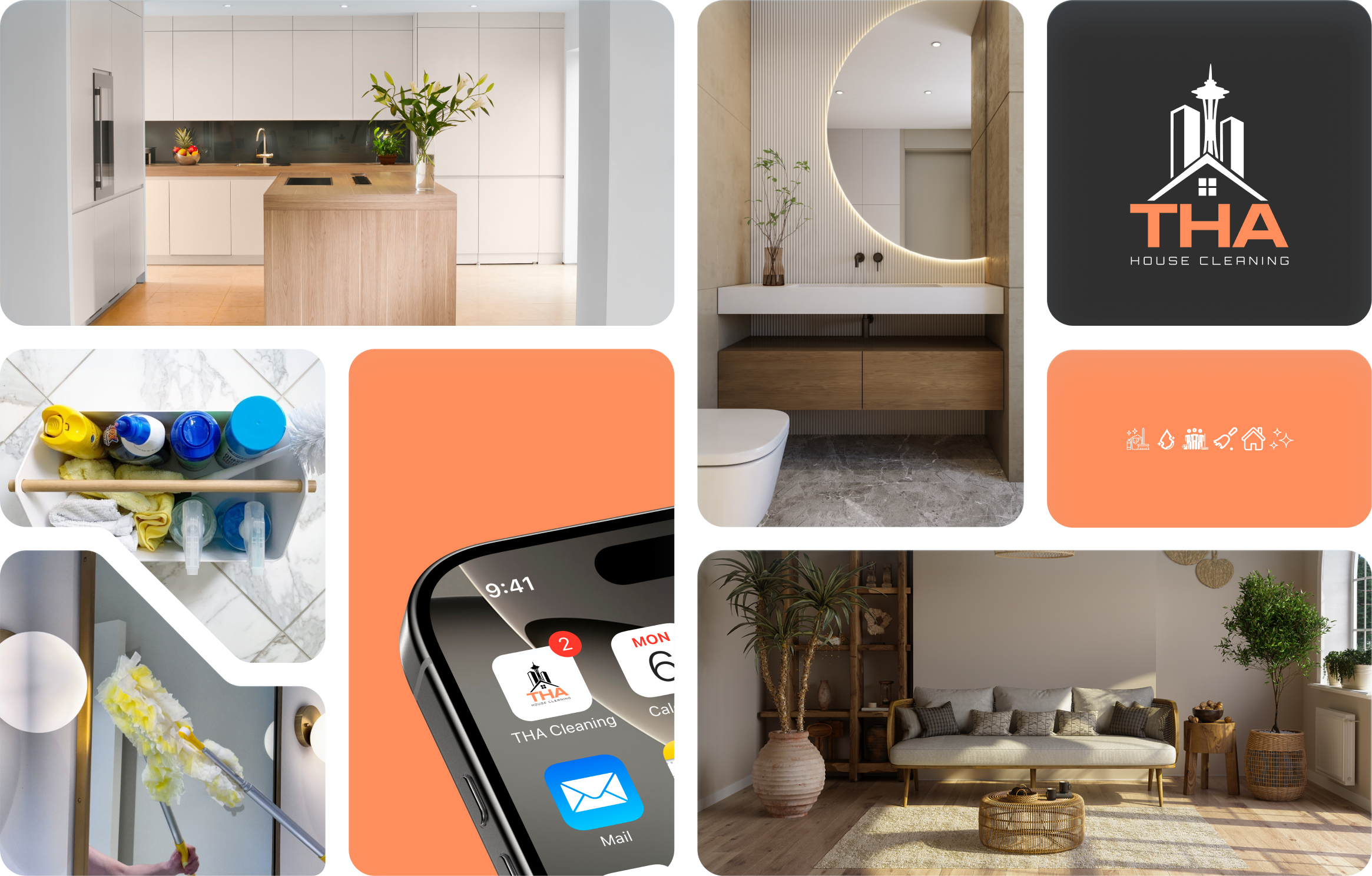
A distinctive mark for a brand built around the feeling of home. The logo brings together an architectural symbol and a clear THA wordmark, creating a recognizable signature for a professional cleaning service.

An architectural house mark, a warm orange wordmark, and a clear visual signature.
Designed to remain recognizable across the website, business cards, and everyday brand communication.
02 / THA CLEANING
Brand identity & typography
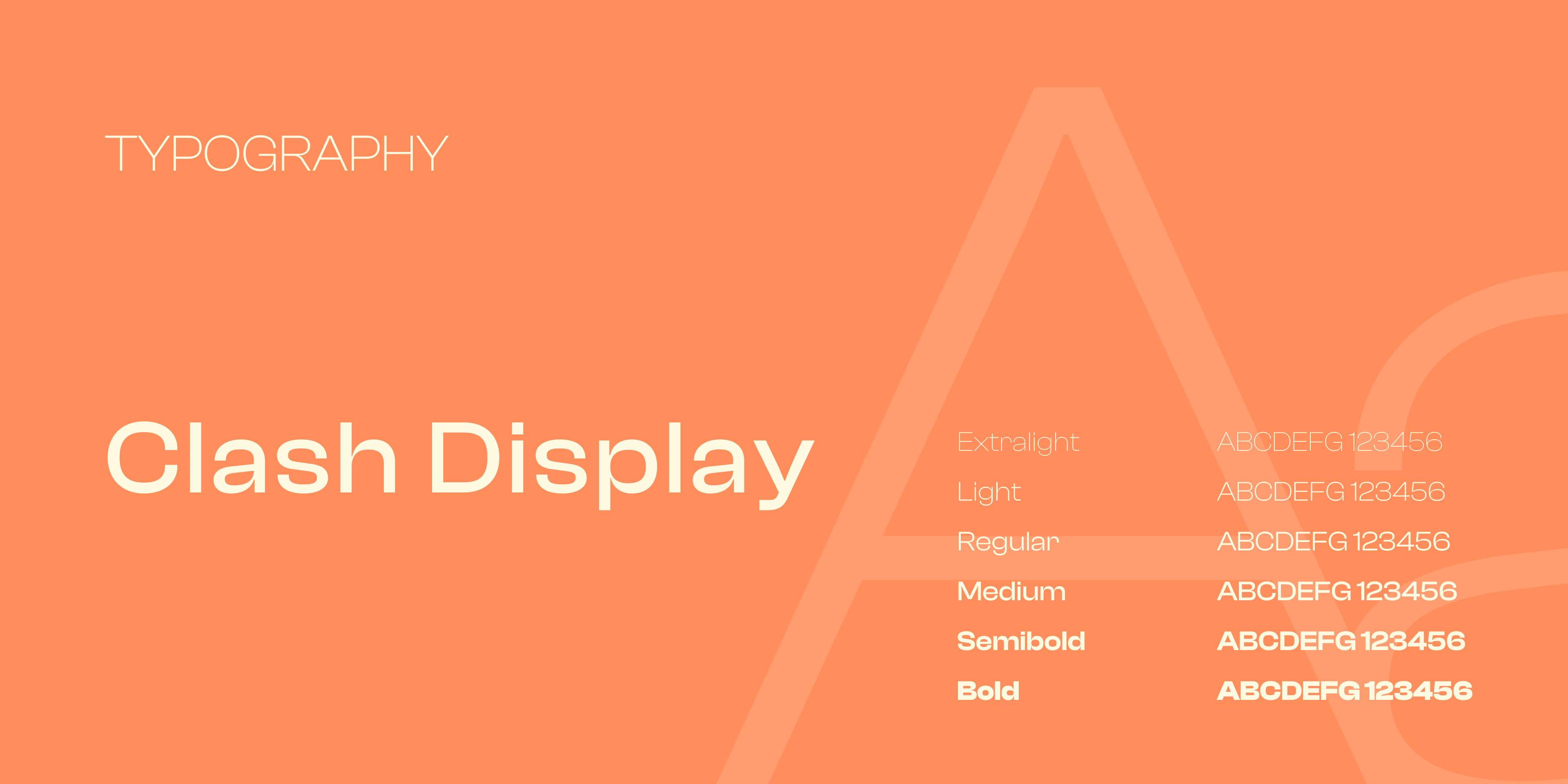
Warm color, confident typography, and a consistent visual language connect every part of the brand. The orange and cream palette gives the identity a welcoming character, while charcoal adds contrast. Clash Display introduces a confident typographic voice across the brand presentation.
03 / THA CLEANING
Print design
The same identity, brought into the physical world. We carried the logo, typography, and color palette into the business card, balancing a distinctive first impression with practical, easy-to-find contact information.
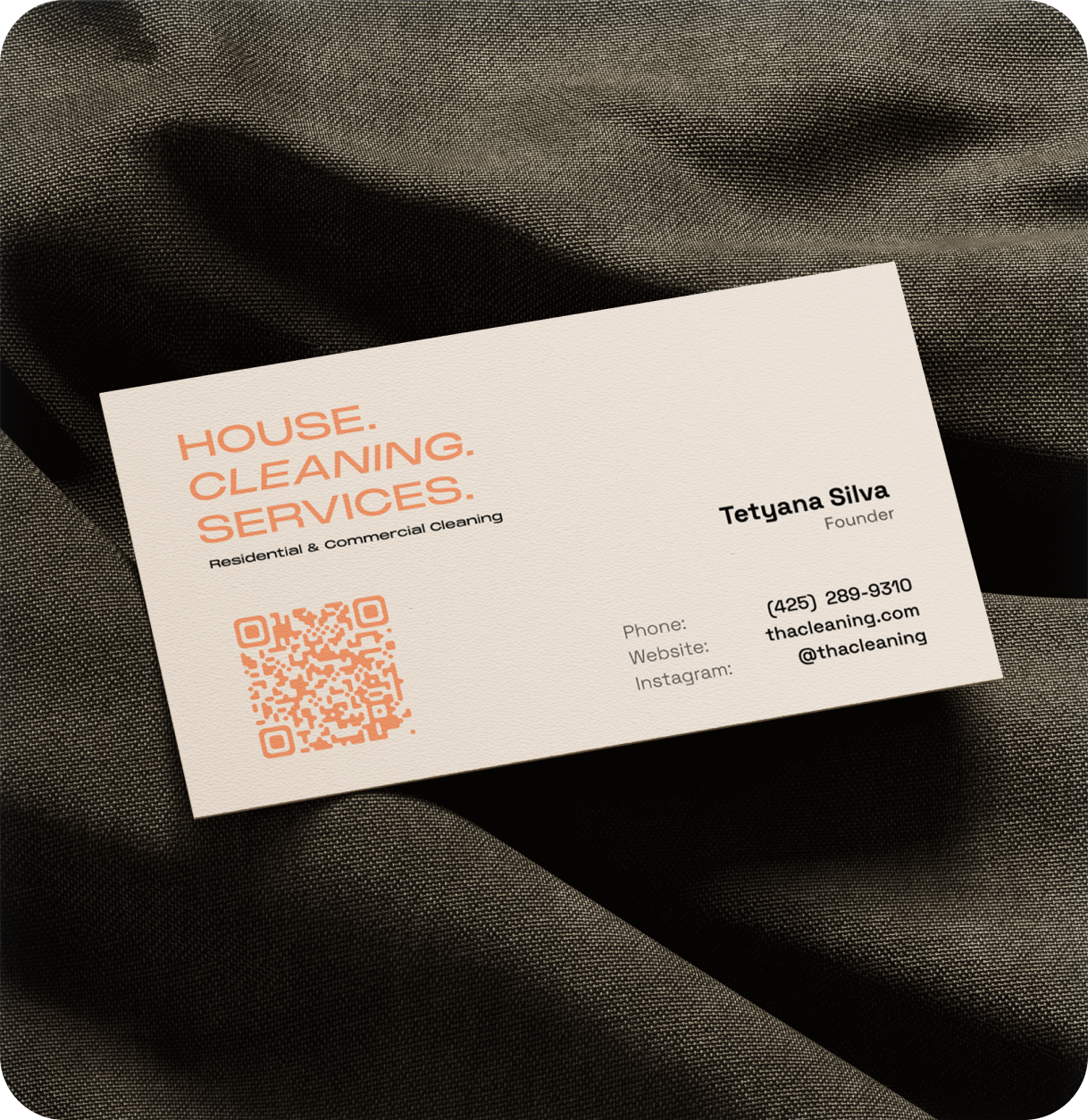
A considered business card that makes the next step easy.
Clear typography, a cohesive color palette, and a scannable QR code carry the brand from a first conversation to its digital experience.
04 / THA CLEANING
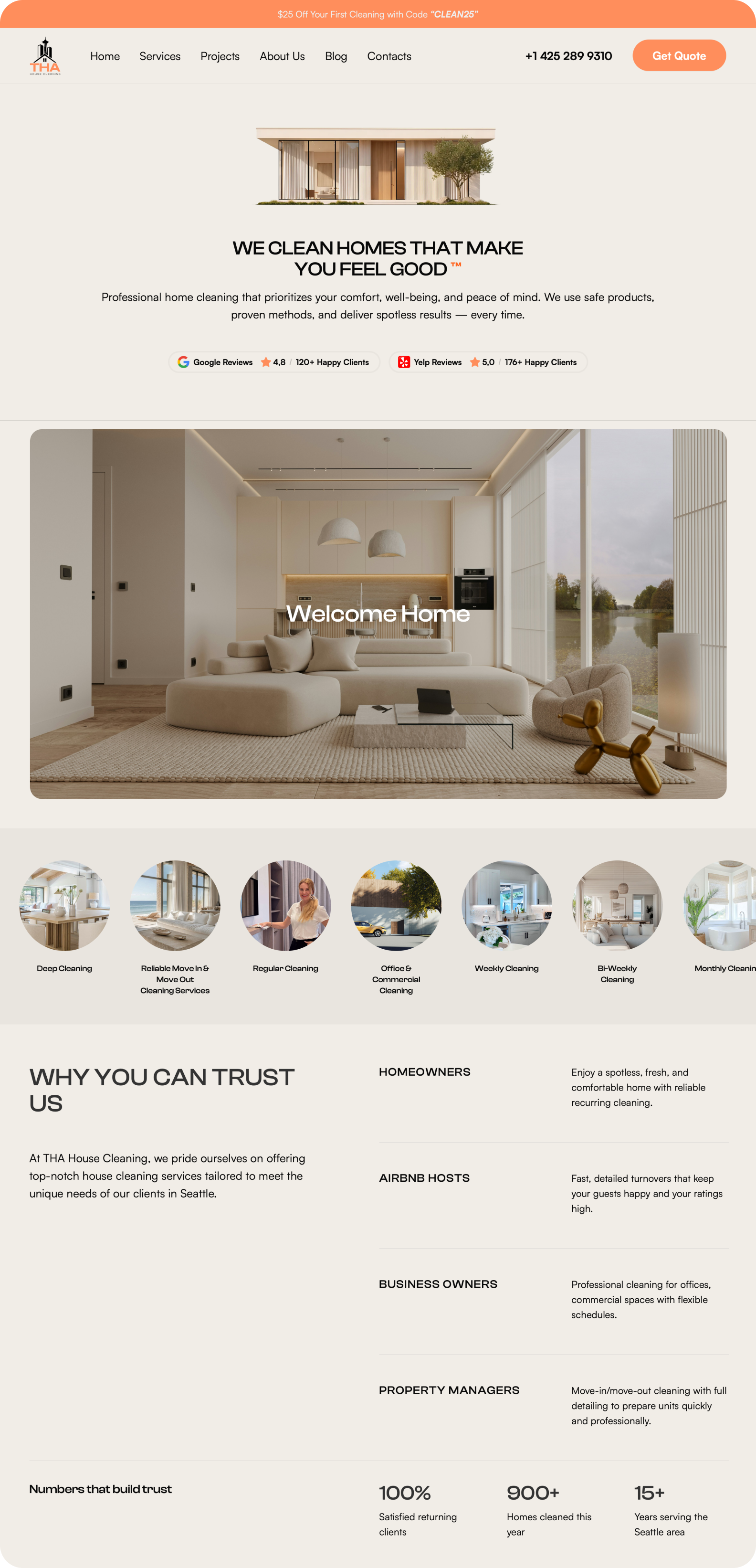
Website design & development
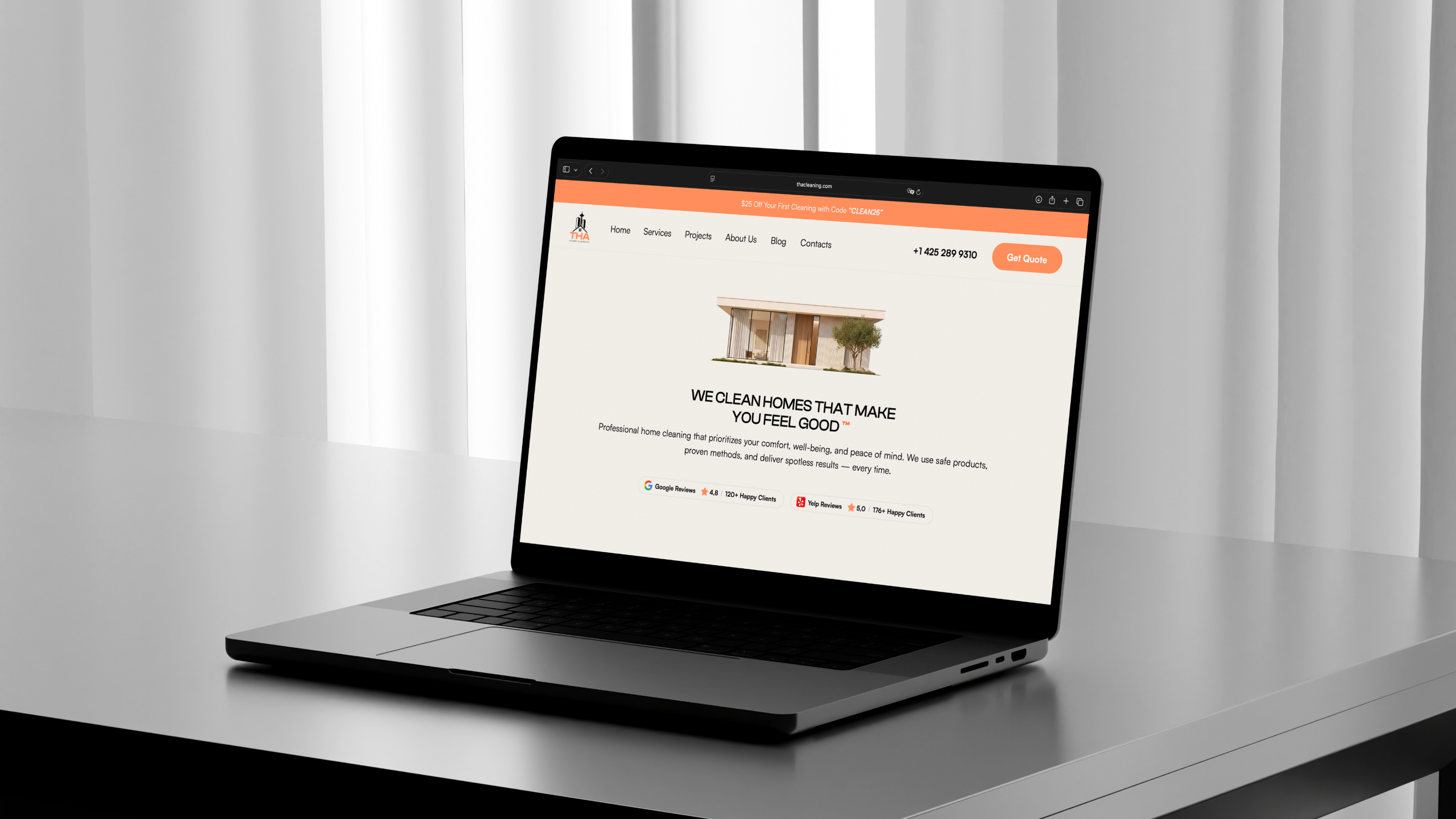
A responsive website that brings the brand to life, explains the services clearly, and gives visitors a direct path to get in touch. Designed in Figma and developed in Webflow, the experience connects service information, trust-building content, and inquiry points within one consistent visual system.