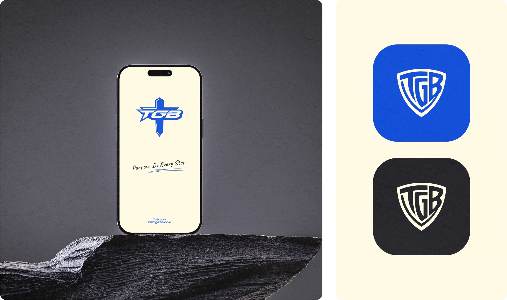
Team Give Back is a faith-inspired initiative with a simple ambition: help people find confidence, connection, and self-expression through sport and movement. With an initial focus on athletic footwear for underserved youth, the founder came to us with a name and a vision. We shaped that starting point into a complete visual identity: a versatile TGB logo system, a distinctive color palette, expressive typography, and a brand book that brings it all together.
Brand Identity
Logo Design
Brand Guidelines
Typography
Art Direction
01 / THE CHALLENGE
Turn a name and a giving-first vision into a modern sports identity. The brand needed to feel energetic and welcoming while expressing the founder’s faith and commitment to helping others.
02 / OUR APPROACH
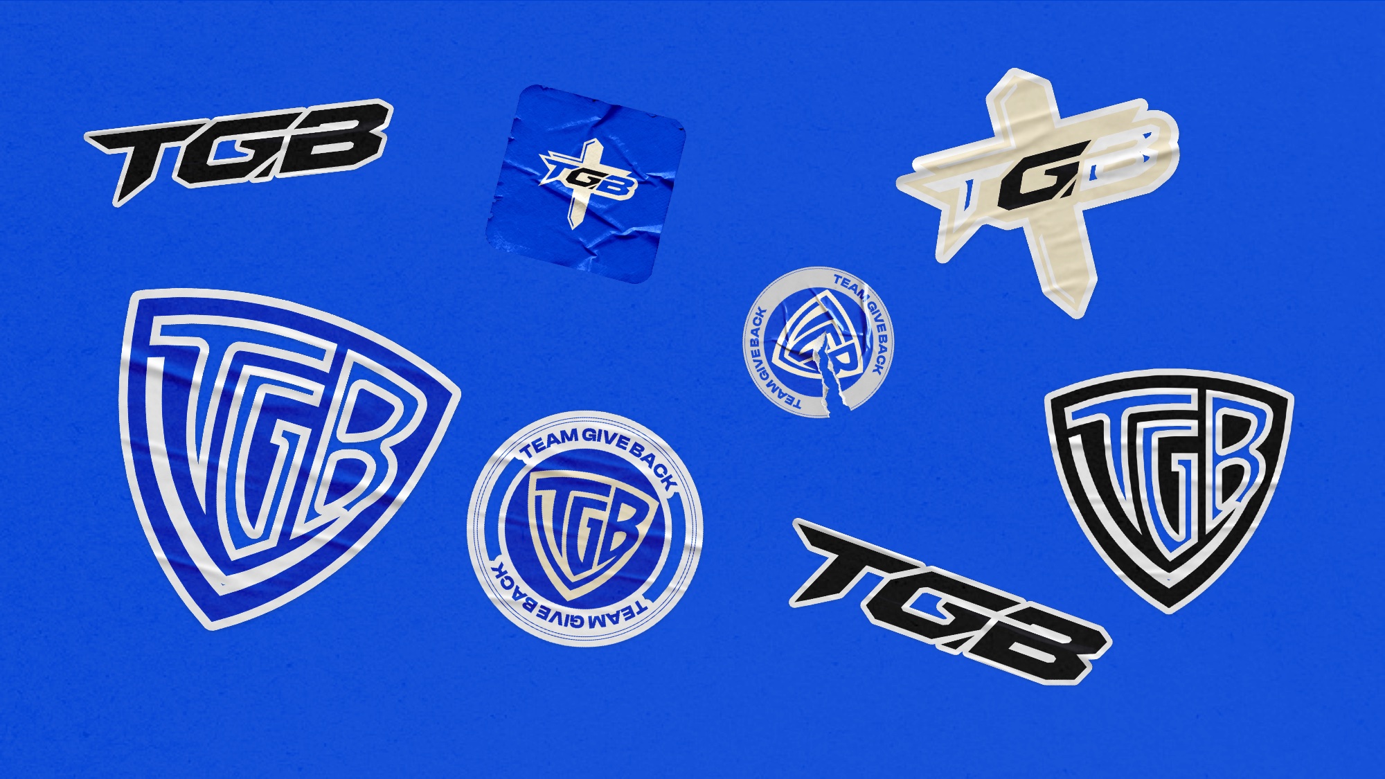
Build a flexible identity around three complementary marks: a shield monogram, a dynamic TGB wordmark, and a cross-led variation. Carry one clear visual language through color, typography, and brand applications.
01 / TEAM GIVE BACK
One purpose. Three expressions.
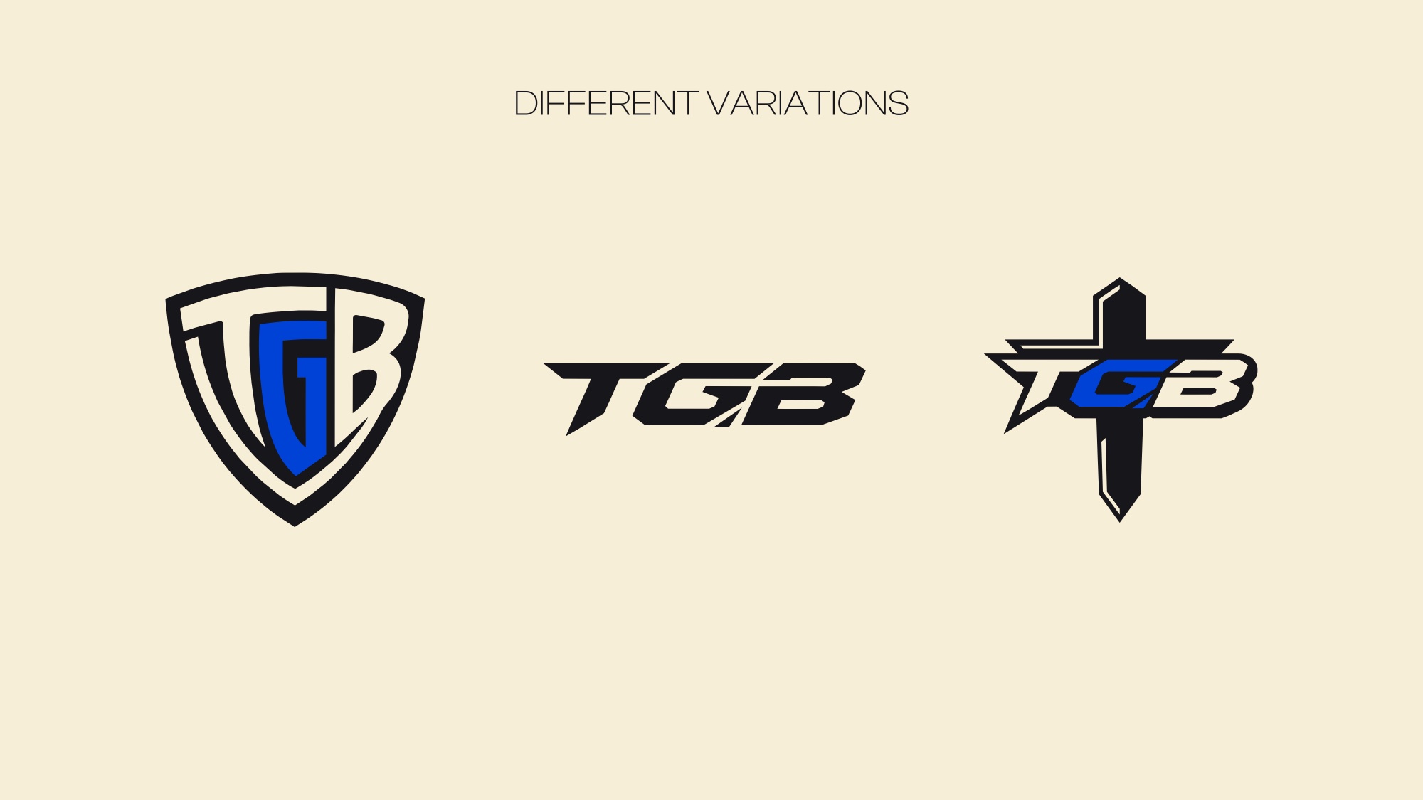
The shield brings the TGB initials together in an emblem of belonging and support. A forward-moving wordmark adds the energy of sport, while the cross-led variation gives the founder’s faith a clear place in the system. Each mark shares the same confident visual character.

02 / THE VISUAL LANGUAGE
Give back. Move forward.
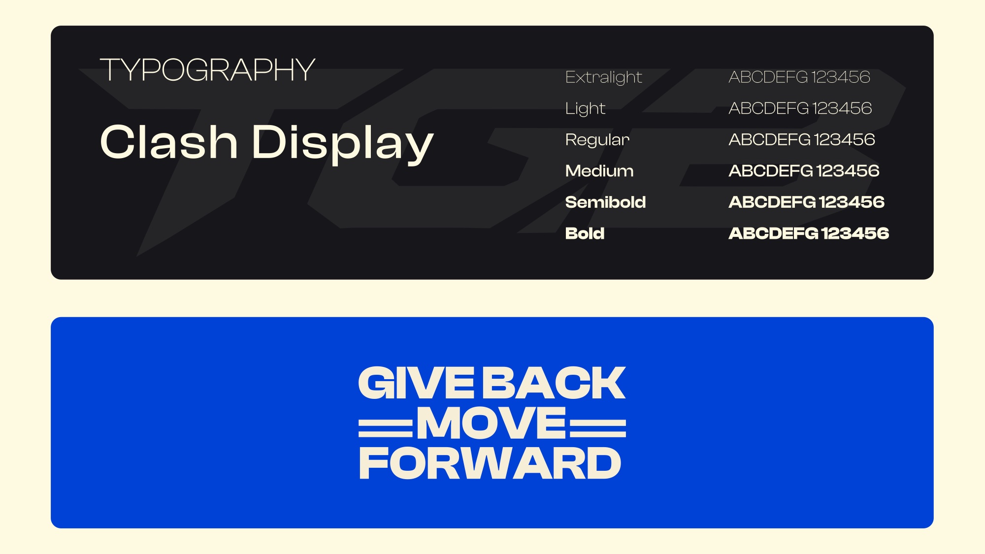
Primary Blue (#0042D5) brings energy, Sand Neutral (#F7EED7) adds warmth, and Dark Base (#17161A) anchors the identity. Clash Display provides a bold, contemporary voice. Supporting graphics, patterns, and the message “Purpose in Every Step” connect movement with meaning.


03 / BRAND IN THE WORLD
Built to move with the mission.
From digital touchpoints and stickers to apparel, signage, and posters, the applications show how the identity can live beyond the logo. A cohesive brand book gives Team Give Back a clear foundation for future communication as the initiative develops.